
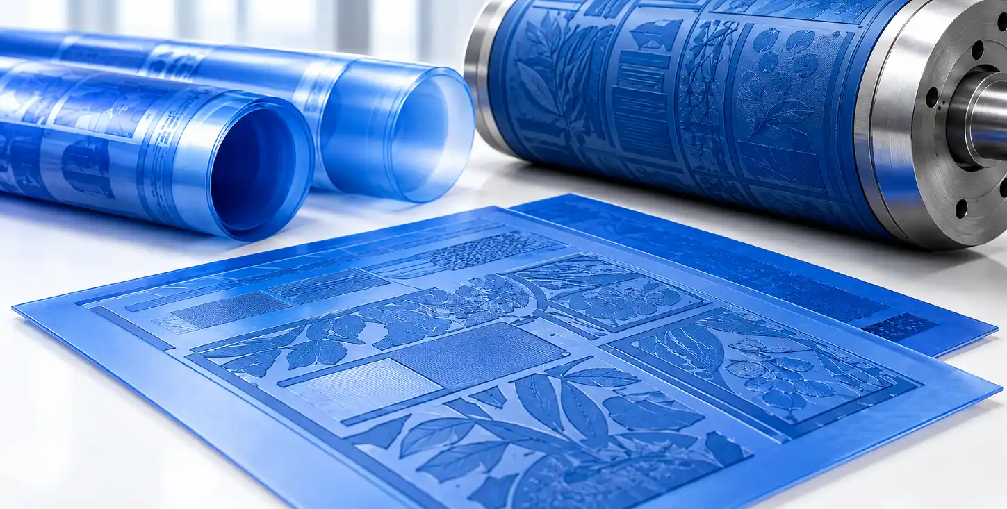
Fine lines and tiny text have a way of exposing weaknesses in a print job. A design can look perfect on a monitor and still lose a thin rule, close-up small lettering, or muddy a detailed pattern once it is printed. That is not necessarily a problem with the original artwork. Print is a physical process, and the artwork has to survive several stages before the finished image reaches the substrate. When we handle detailed graphics, we look at the artwork with that reality in mind. The question is not simply whether the file looks good. The real question is whether its important details can be reproduced cleanly and consistently.
Why Fine Details Need More Attention
Large graphic areas are generally forgiving. A small flaw in a broad solid area may barely register, but a line that is only slightly too thin can disappear altogether. The same applies to small type, tight counters in letters, and intricate illustrations where several elements sit close together. Resolution, dot formation, exposure, plate relief, ink transfer, pressure, and the printing substrate can all influence how those details appear. We therefore examine the structure of the artwork rather than relying on its appearance at normal screen size. Zooming in is useful, but viewing the design at its intended physical size matters just as much. That is often where questionable details become obvious.
Getting Small Text Right
Small text deserves particular scrutiny because readability depends on details that are easy to overlook. Product descriptions, ingredient information, warnings, specifications, and other compact copy may contain characters with very fine strokes or narrow spaces. If those areas are too delicate, letters can close up or lose definition during printing. We review type size, stroke weight, spacing, and surrounding elements as part of the artwork assessment. Font choice matters too. Two typefaces at the same point size can behave quite differently because their letterforms have different proportions and stroke structures. Good preparation does not mean changing a designer’s work unnecessarily. It means understanding which parts of that work have enough physical room to reproduce as intended.
Keeping Fine Lines Clean
Fine rules and hairline elements often look simple, but they can be surprisingly demanding in production. A narrow line may be used as a border, a decorative feature, part of an illustration, or a small technical detail. If it sits too close to another element, the gap between them may become difficult to hold. The result can be a line that appears heavier, weaker, broken, or less distinct than expected. We pay attention to line width, spacing, intersections, and the balance between printed and unprinted areas. Those checks are especially useful when artwork contains repeated patterns or fine decorative work, where a small change can become noticeable across the entire design.
Preparing Detailed Graphics for Plate Production
Good artwork preparation gives plate production a much stronger starting point. We look at resolution, image construction, tonal information, fine detail, and the way different graphic elements interact before production moves ahead. The goal is to understand how the file will translate into physical printing rather than treating the digital artwork as the final authority. This is where the relationship between the artwork and flexographic printing plates becomes important. A plate can only reproduce what the production process allows it to reproduce. When the artwork has been prepared with those limitations in mind, there is a better opportunity to retain the detail that matters.
What We Check Before Production
A detailed file deserves a deliberate review, particularly when the design will be used repeatedly or across a demanding packaging application. We typically pay close attention to:
- Fine lines that may be too narrow to reproduce reliably
- Small type with tight spacing or delicate strokes
- Fine patterns with limited separation between elements
- Image resolution and the quality of raster information
- Positive and negative areas that sit close together
- Gradients, highlights, and subtle tonal changes
- Artwork elements that may need adjustment before production
None of these checks is about making a design look different for the sake of it. They are about identifying where the physical printing process could interpret the artwork differently from the way it appears on screen.
Why Repeatability Matters
A detailed graphic that looks good on one run but changes noticeably on the next is not doing its job. Packaging and other printed materials often need to maintain a consistent appearance over repeated production. Small type should remain legible, brand elements should retain their proportions, and fine graphic features should behave predictably. That consistency depends on the interaction between artwork, plate preparation, press conditions, ink, substrate, and production control. Careful pre-press work cannot eliminate every variable on the press, but it can remove avoidable problems before they reach that stage.
Bridging the Gap Between Screen and Press
One of the easiest mistakes in print preparation is assuming that what appears on a high-resolution display will automatically reproduce the same way on the finished substrate. It will not always. Screens can show incredibly fine detail, while printing has physical limits determined by the plate, ink, substrate, and press. We therefore treat artwork preparation as a practical translation exercise. The designer’s intent remains important, but so is understanding what the printing process can physically hold. That balance is particularly valuable when a job contains small lettering, delicate lines, fine screens, or detailed illustrations.
Conclusion
Fine detail is rarely something worth leaving to chance. When the artwork is reviewed with the actual printing process in mind, potential problems can be found while they are still easy to address. The result is a cleaner path from digital artwork through plate production and onto the press. PlateCrafters works with printing teams that need careful preparation for demanding graphics and detailed print work. Contact us to discuss your artwork, production requirements, and the flexographic pre-press support your next project needs.
FAQs
1. Why is pre-press important for fine lines and small text in flexographic printing?
Proper pre-press preparation helps ensure fine lines, small text, and detailed graphics reproduce clearly and consistently.
2. What artwork details should be checked before flexographic plate production?
Line thickness, text size, spacing, image resolution, gradients, and positive and negative areas should be reviewed carefully.
3. Can small text be reproduced clearly in flexographic printing?
Yes, when the type size, stroke weight, spacing, and artwork are prepared appropriately for the printing process.
4. How does artwork preparation affect detailed graphics?
Careful preparation helps preserve intricate patterns, fine lines, tonal details, and other important graphic elements during production.
5. What does PlateCrafters review during pre-press preparation?
We review artwork structure, fine details, resolution, text, spacing, and other elements that can influence final print quality.